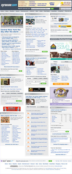
 I’m not sure when it went live, but the new Syracuse.com looks like a significant step up from the prior design shared by all Advance Internet sites (including Pennlive, which posts stories written by my newspaper. Clicking those two pretty much gives you the before and after for Syracuse). Read more details of the Syracuse.com redesign at the site.
Before I praise it too much, a caveat: It’s still lipstick on a pig. We need a rethinking far more than we need a redesign. I’m still waiting for a truly innovative newspaper site that establishes itself as the real town square of the local Web. That won’t happen until newspapers start leading the way in the social aspect of the Web, instead of just doing its duty with a few blogs and forums.
That said, the Advance team deserves some praise for what amounts to significant cosmetic and usability improvements. The labyrinthine layout of the Advance template has been the bane of journalists nationwide, as we produce great content that can’t be found by our readers. This looks to go a long way toward reducing the usability problems.
- Placing the “Real-Time News” box in the top left corner is a fool-proof way of ensuring that the newspaper’s true brand, the breaking news and enterprise, gets the placement it needs. I don’t think five breaking news headlines are enough, and I wish there was a place to better promote the print stories, but this is a step in the right direction.
- This is done without coming at the expense of sports stories, the apparent click-magnets, by giving them just as much visibility at the top. Under the previous design, sports and news competed for precious little space atop the site. It’s wonderful that they’ll never have to compete again.
- The ability to search entertainment listings from the home page is a good idea, and I hope the staff is up to providing the exhaustive listings that it would really need. I know in Harrisburg there’s a hard-working crew at Spotobe who are plenty willing to pick up the slack.
- Perhaps most exciting is the better play of videos and photos. Of all the usability issues with the prior design, this was perhaps the most glaring. At my paper, quality videos and photos were consistently buried in an obscure blog that wasn’t consistently linked on the home page.
- I enjoy the Interact box, and easily seeing where the most comments are coming in.
Much more work remains, and I’m sure I’ll find more problems once I dig deeper through the site. But if this home page design comes to my paper soon, I’ll be a happy reporter.