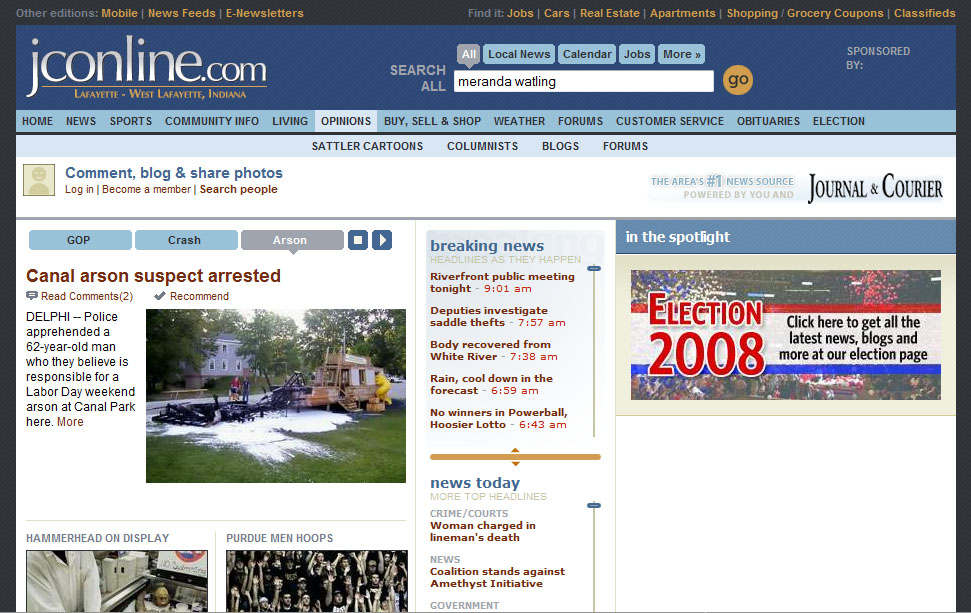
(This is my contribution to the Tomorrow’s News, Tomorrow’s Journalists blogring of young journalists. Our topic this month was to review our local newspaper’s Web site — but seeing as I work for the local newspaper and I am not dumb, I decided to switch papers with Meranda Watling, who has the same problem and suggested the switch.)
Though I’ve only been to the Journal and Courier site when linked there by Watling, the design is already known to me. Since it’s a Gannett paper, it looks just like other Gannett news sites I’ve recently visited such as The Des Moines Register, Cherry Hill Courier-Post or the Wilmington News-Journal.
— First things first: I really like the front page design. A lot. It crams an impressive amount of headlines on the front page, even “above the fold,” without feeling overwhelming. It simultaneously promotes the staff’s breaking news online and their work for the print edition. It doesn’t take a lot of hunting to get all the headlines I would need.
My favorite feature is the scrollable “Breaking News” box. A bit misnamed, yes, but effective in that you can scroll down at 11 p.m. and see headlines all the way back to early that morning. That works around the problem many other news sites have of listing only five or so headlines on the front page, which means the reporter who hustled to get an important story online at 10 a.m. might have her work buried by noon. No such problem here.
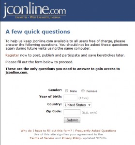
— Now, to an annoyance. After I clicked on a few stories, I got this dreaded screen that I mistakenly thought was left in the yesteryear of news sites:
Had I not been on a quest, I likely would have A) indignantly closed out the window, or B) Made up a bunch of stuff. But I work for a newspaper company, so I would never do such a thing. Everyone else, though, would just be highly annoyed by this extra gateway. I’m very skeptical that it would provide any significant, reliable information, anyway. That’s what analytics are for.
Also, an interesting wording in that description you probably skipped over: “To help us keep jconline.com available to all users free of charge, please answer the following questions.” Really? Gannett is openly suggesting charging for content is an option? And “free of charge” is redundant. It’s just “free.”
— Now, as part of the media elite, I have a lot of dispensable income that I’d like to spend somewhere in Lafayette. If only I could find a business somewhere trying to grab my attention. I should be able to check the front page of the biggest online news source in town and find someone who wants my ridiculous amount of extra money, right?
Nope. No ads. “Hey, maybe we should have ads on the front page of the site” strikes me as the 2008 version of the “Hey, maybe we should have a blog or two on the site” insight of yesteryear.
(UPDATE 1:57 p.m.: Meranda Watling points out that there are actually ads on the front page, but that I apparently have a very effective adblocker. Good news on all fronts.)
— One feature of the site that I’m very impressed by: The user profile. Take Jack Lahrman, apparently an active user of the site. Through that one link, you can learn a bit about who he is, see all of his blog posts and comments or leave him messages.
Doesn’t look like the community has really caught on to its usefulness, but as I’ve written before, it’s important to develop these profile pages. They’re going to be a key part of the future.
— Unfortunately, a big demerit: The site doesn’t promote its blogging very well. At first, I didn’t see any blogs linked on the front page, but I eventually found them by hovering over a far-down, small icon that I guess looks like a pen over a sheet of paper. If I didn’t happen to be specifically searching for blogs, I would have never found them. I don’t even get a link to the Purdue football blog on the Sports front — I have to actually go to the Purdue page for that.
Once I find the Purdue football blog, I’m disappointed to see the design has made it very difficult to enjoy. I need to scroll past the author’s biography to get to his content, meaning I’ll notice one of his favorite movies before I notice his insight on the football program. That content is awkwardly teased by just two sentences, which often isn’t enough to draw readers into an entry. And once I click on his entry, I again have to scroll past his who-cares bio to get to the meat.
That’s a lot of work this Web site is expecting of me, especially when some of the blogs are updated just once per week. Or if it’s the publisher and editor’s blog, once a month. That’s a shame, because I love reading blogs from editors and I think the readers would enjoy reading it more often.
— Other quick-hits:
Once logged in, it’s nice and easy to leave comments at the bottom of articles, and even easier to read other comments.
I don’t really understand why the second and third graf of each story is slightly indented. Kinda distracting and confusing.
The mobile site, as accessed from my Blackberry Pearl, is simple and quick.
I’m encouraged by a few podcasts that are evidently produced by the staff.
Like the blogs, videos are hard to find if you’re not looking for them. However, a video about a motorcycle was nicely attached to the story about it.
I can easily find a form to submit a story tip, or contact a specific person in the newsroom.
VERDICT: I give it a B-. If your priority is to quickly scan and access the news of the day, this site does it better than most out there.
What it lacks, though, is the kind of innovation that will push the newspaper’s brand forward. It has to better package its Web-only content and show why the site can become more than a place to stop for news.

